Colorblind - A Different Perspective
Being a hereditary carrier of the recessive 'colorblind' genes, I have first hand experience seeing my sons growing up with being Red/Green Color Deficient, often referred to as 'colorblind'. All of us 'color-seers' could not relate to or understand why, when asked if one wanted to put on a green shirt (St. Patty's Day), he put on a tan one insisting it was green, and finally settled on saying "it's close enough". That is, unless others searched as long and hard as my husband did years ago to find a very usefull Photoshop plug-in from VISCHECK for transforming pictures into how 'colorblind' individuals see the world, and everything in it. A search engine will bring up web-site design links that allow you to transform your site (generally for a fee) as well, but the plug-in is free, can be used on any image, and has been an invaluable tool we have utilized for years. (NOTE: Photoshop plug-in hyperlink will take you to a download page where you can select your operating system & download if you wish.)
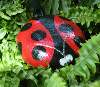
The following images on the left were greatfully provided and selected from the wonderful community of Etsy.com as examples of variance in color. Images on the left are as we see, and images on the right are as they see, after transforming using the plug-in at default levels. Click on images for full size.
The following images on the left were greatfully provided and selected from the wonderful community of Etsy.com as examples of variance in color. Images on the left are as we see, and images on the right are as they see, after transforming using the plug-in at default levels. Click on images for full size.
Image Copyright of Artist All Rights Reserved
Unfortunately, there is no way to allow those affected such a tool, though my sons would so very much like to know how we see red & green and every color mixture thereof. They also cannot relate to, or understand why we say certain colors "clash", and why we suggest that certain colors shouldn't be worn together, or why we get big smiles when they pick out shirt colors at a store that you would normally dress your daughter in.
Artist : Laurie Ryan Title: Butterfly
Medium: Fine Art Photo Link: ™Photos by Laurie Rae, Inc. Etsy Shop
Image Copyright of Artist All Rights Reserved
In a way, the whole family is affected by colorblindness: it's a factor when buying gifts, clothes, even playing video games on the Playstation like Call of Duty World at War, etc. We learned to be more patient when aksing for the red or green crayons when they were little. Actually, that was our first indicator that there was a deficiency. For example: they could not distinguish the light pink crayon from the light green, but quickly adapted by reading the labels on the crayons. When we asked "what color is that?" the response was not just "red", or "green", but Crayola color names like "Brick Red" or "Pine Green". While at times it was quite amusing, a toddler asking for "Burnt Sienna" took some time to decipher. When the labels had fallen off, they got quite frustrated. Eventually this gave way to lumping all the secondary/tertiary colors into just 'reddish' and 'greenish'.
Image Copyright of Artist All Rights Reserved
We are completely amazed when they can find small lost items in a yard of green grass after we spend hours searching, yet they find in seconds. Or that they can pick out camouflaged things, or animals in the distance, while we 'color-seers' have to strain to see what they are looking at. Seems the brain compensates for lack of color differences by emphasizing minute tonal values we take for granted. The Wikipedia article even touches on this fact saying, "At one time the U.S. Army found that color blind persons could spot "camouflage" colors that fooled those with normal color vision." The left out the fact that it was an advantage, and that they used these "persons" as snipers. Some sites even state that shapes and outlines are enhanced as to explain why nothing appears camouflaged or hidden.
Medium: Acrylic Painted River Rock Link: ellenray Etsy Shop
Image Copyright of Artist All Rights Reserved
It is estimated that 7-10% of men are Red-green color deficient, according to this Wikipedia chart. Wouldn't the world look quite different if we had taken this into consideration long ago? For instance, red and green would hardly be used and perhaps stoplights would be blue and yellow.
Artist : Melissa Zahradnicek Title: Mary, Mary
Medium: Fine Art Photo Link: MyNovember Etsy Shop
Image Copyright of Artist All Rights Reserved
Besides an interesting shift of perspective, you might ask, "how does this pertain to me?" You could be missing out on 10% of the male population....

.jpg)
.jpg)

.jpg)

.jpg)

.jpg)
.jpg)


Thanks to my husband for all the help in creating this post, and with the Vischeck. Without his help this would not have been possible.
ReplyDeleteThis is very interesting. Makes me want to ask your boys which of the 12 sample paint colors for our dining room wall (we're stuck in decision-limbo about them), that THEY find most attracctive.
ReplyDeleteBTW -- I am anonymous, it's the only way I could post - Sandy
ReplyDeleteSo interesting to see these photos, thank you for sharing. My son is almost four and I spent a long time worried that he was green/red colorblind. I'm pretty sure now he just confused them because he was young.
ReplyDeleteThank you so much for writing this article and sharing. It is quite possibly one of the best reads for me in a very long time. Educational and fascinating. I will be thinking about this article throughout the day as I see color. :)
ReplyDeleteI have often wondered and now I know. You've given me much food for thought as how to cater to those who are Color-Blind. Thank you. ~ Gracie
ReplyDeleteFascinating! Thank you for sharing!
ReplyDeleteMichelle-
VERY interesting, thanks for sharing :D
ReplyDeleteLaci
Absolutely love seeing this color perception comparison ... Very cool! Amazing how different the world can look from person to person. And awesome how the colorblind often have other compensatory visual skills that the rest of us lack. Nice to meet you, glad I discovered your blog. :-)
ReplyDeleteinteresting!
ReplyDeleteThat was a great read, really interesting - thank you.
ReplyDeleteI have found that on the whiteboard purple is quite a common colour to have problems with.
(And my favourite dahl recipie: http://www.healthyfood.co.nz/recipes/2009/april/carrot-and-red-lentil-dhal )
Thank you for sharing! This was incredible - I never knew or understood how color blind people see or react to things I take for granted every day.
ReplyDelete